Custom QR Code Design: Colours, Logos and Styles That Still Scan
Brand colours, rounded dots, a logo in the middle — here's how far you can push QR code design before phones stop reading it, with safe rules you can follow every time.
In this article ▾
A plain black square does the job, but it rarely says anything about your brand. A custom QR code — in your colours, with your logo and a friendlier dot pattern — looks intentional, feels more trustworthy and fits naturally into menus, packaging and posters. The catch is that every design choice changes how easy the code is to read. This guide shows you how far you can go, and where to stop.
Everything below can be tried in PaperBee's free QR code generator. Open it in another tab and experiment as you read — the live contrast check will warn you when a choice gets risky.
First, how a phone reads a QR code
Understanding the scanner makes the design rules obvious. A phone camera first looks for the three finder patterns — the big squares in three corners. Once it finds them, it works out the code's angle and size, then samples every module (dot) in a grid and decides whether it's dark or light. Finally, error correction repairs any modules it couldn't read.
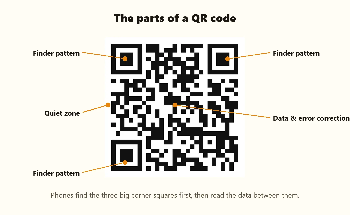
So the golden rules are simple: the corners must be easy to find, dark and light must be easy to tell apart, and the code needs a clear border around it.
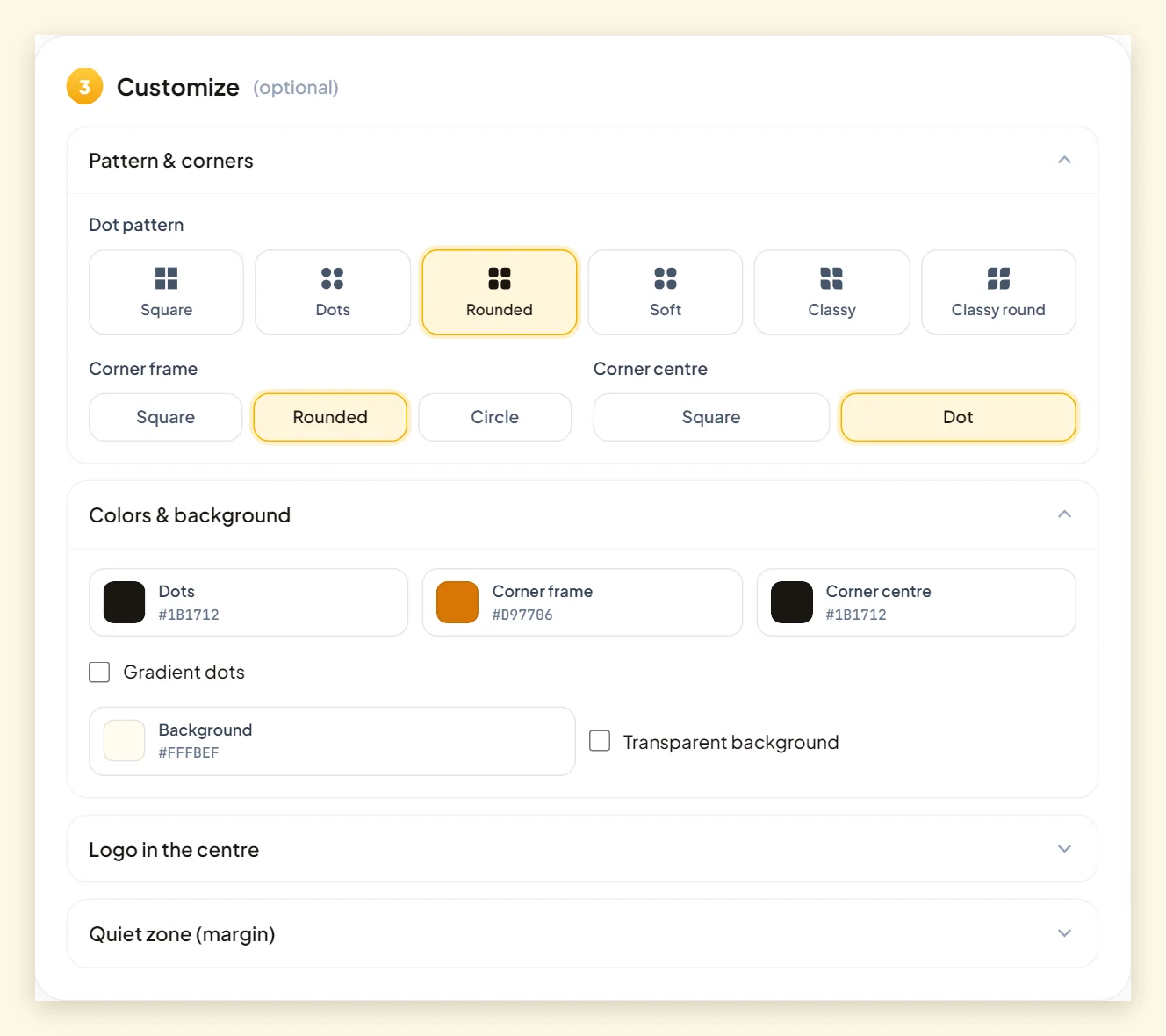
Choosing a dot pattern
The modules don't have to be sharp squares. Phones only care whether each module's centre is dark or light, so rounded and dotted shapes scan just as well when they're not too small.
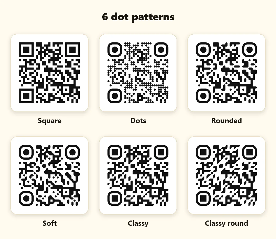
- Square – the classic look. Best for official documents, certificates and ID cards.
- Rounded and Soft – friendly and modern; great for cafés, kids' brands and invitations.
- Dots – playful and light, but use it at larger print sizes because individual dots are smaller.
- Classy and Classy round – leaf-shaped modules that look premium on packaging and luxury brands.
Styling the corners
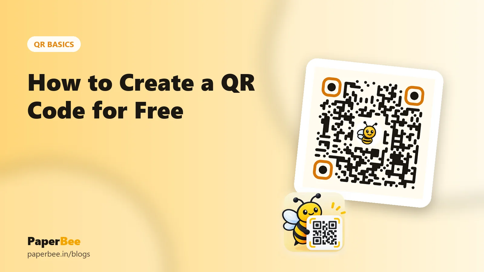
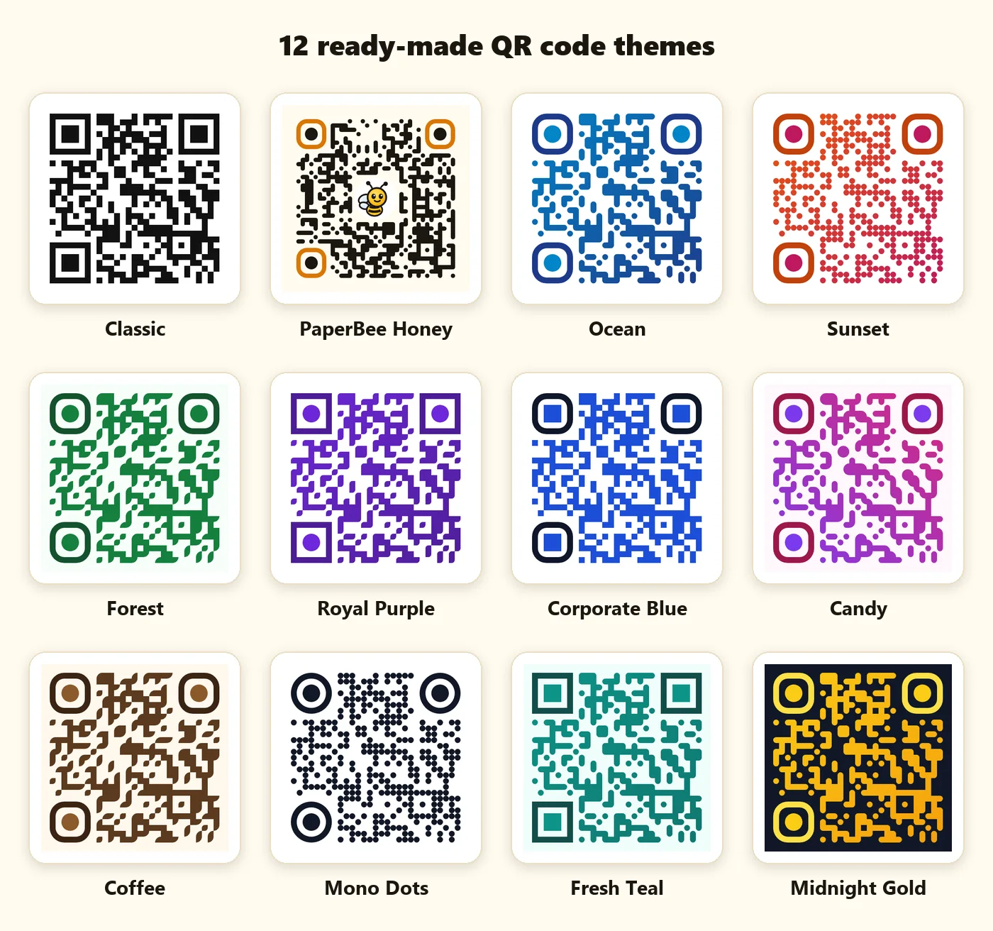
The corner frames and their centres can be square, rounded or circular, and can have their own colour. A coloured corner frame is one of the easiest ways to brand a code — our PaperBee Honey theme, for example, uses amber rounded corners with dark dots. Just keep the corners at least as dark as the rest of the code; they're the first thing a phone looks for.
Colours and contrast: the rule that matters most
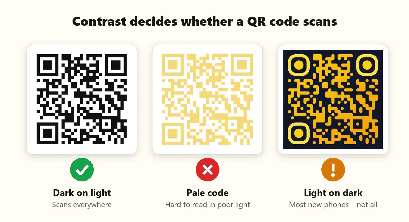
Contrast decides whether a code scans. Cameras convert the image to light and dark, so a code needs a big brightness difference between the dots and the background — not just a different hue. Red on green, for example, can look striking to you but turn into similar greys for a camera.
| Choice | Result | Tip |
|---|---|---|
| Dark colour on white or cream | Scans everywhere | Navy, deep green, purple and brown all work |
| Two-colour gradient (both dark) | Scans well | Keep both ends of the gradient dark |
| Pastel or yellow dots | Often fails | Darken the dots or add a dark background |
| Light dots on a dark background | Most new phones | Some older scanner apps can't read inverted codes |
| Transparent background | Depends on placement | Only place it on plain, light surfaces |
Gradients
Gradients make codes look modern — think the Sunset (orange to pink) or Ocean (sky to navy) themes. The rule is the same: both ends of the gradient must contrast strongly with the background. Avoid gradients that fade into white.
Adding your logo in the centre
A logo in the middle instantly tells people whose code it is. It works because of error correction: QR codes come in four levels — L (about 7%), M (15%), Q (25%) and H (30%) of the code can be damaged and still read. When you add a logo, PaperBee automatically switches to level H and clears the dots behind the logo so it sits cleanly.
- Use a simple, square-ish logo with a solid or white background.
- Keep it under about 30% of the code's width — the generator's slider defaults to a safe size.
- Avoid tiny text inside the logo; it won't be readable at small sizes anyway.
- Test the final code with two different phones before printing.
Start from a theme, then make it yours
If you don't want to design from scratch, start from one of the 12 ready-made themes and tweak a colour or two. Every theme is tuned for contrast, so it's a safe starting point.
A designer's checklist before you print
- Dots and corners are clearly darker than the background.
- The quiet zone (white border) is intact — at least 4 modules wide.
- The logo covers no more than about 30% of the code.
- The code is at least 2 × 2 cm in print; bigger for posters.
- You downloaded SVG for print so edges stay crisp.
- You scanned the printed proof with two phones, in normal light.
Read the QR code printing guide for sizes and paper choices, or see how to create a QR code if you're just getting started.
Summary
Custom QR codes are about balance: be creative with dot shapes, corners and brand colours, but protect the three things scanners rely on — bold corners, strong contrast and a clear border. Add a logo with high error correction, keep it modest in size, and always test before printing. Do that, and your QR code will look like part of your brand and still scan first time.
Frequently asked questions
Can a QR code be any colour?
Almost. The dots need to be much darker than the background. Dark blues, greens, purples and browns on white work well; pale colours often fail.
Does adding a logo break the QR code?
Not if it's small. PaperBee switches to the highest error-correction level (H), which lets about 30% of the code be covered while still scanning.
Do rounded or dotted QR codes scan as well as square ones?
Yes, at a reasonable size. Phones read the centre of each module, so shape matters much less than size and contrast.
Can I make a QR code with a transparent background?
Yes — tick “Transparent background” and download PNG or SVG. Only place it on plain, light surfaces.
Are inverted (light on dark) QR codes OK?
Most modern phone cameras read them, but some older scanner apps don't. For anything important, use dark on light.
Written by the PaperBee Team
We build free tools that help schools, shops and organisers create professional documents — from QR codes to ID cards and certificates.