%22%3E%0A%20%20%20%20%20%20%3Crect%20x%3D%22150%22%20y%3D%22145%22%20width%3D%22150%22%20height%3D%2294.35%22%20rx%3D%226.75%22%20fill%3D%22%23FFFCF5%22%20stroke%3D%22%231B1712%22%20stroke-width%3D%224%22%2F%3E%0A%20%20%20%20%20%20%3Crect%20x%3D%22150%22%20y%3D%22145%22%20width%3D%22150%22%20height%3D%2222.644%22%20rx%3D%226.75%22%20fill%3D%22%232452A6%22%2F%3E%0A%20%20%20%20%20%20%3Crect%20x%3D%22150%22%20y%3D%22158.209%22%20width%3D%22150%22%20height%3D%229.435%22%20fill%3D%22%232452A6%22%2F%3E%0A%20%20%20%20%20%20%3Crect%20x%3D%22159%22%20y%3D%22177.079%22%20width%3D%2242.00000000000001%22%20height%3D%2247.175%22%20rx%3D%224%22%20fill%3D%22%23FBF4E3%22%20stroke%3D%22%231B1712%22%20stroke-width%3D%222.5%22%2F%3E%0A%20%20%20%20%20%20%3Ccircle%20cx%3D%22180%22%20cy%3D%22192.175%22%20r%3D%229%22%20fill%3D%22%234A4033%22%20opacity%3D%220.5%22%2F%3E%0A%20%20%20%20%20%20%3Cpath%20d%3D%22M165%2C218.59300000000002%20Q180%2C207.27100000000002%20195%2C218.59300000000002%22%20fill%3D%22%234A4033%22%20opacity%3D%220.5%22%2F%3E%0A%20%20%20%20%20%20%3Crect%20x%3D%22210%22%20y%3D%22182.74%22%20width%3D%2263%22%20height%3D%227.548%22%20rx%3D%223%22%20fill%3D%22%231B1712%22%20opacity%3D%220.55%22%2F%3E%0A%20%20%20%20%20%20%3Crect%20x%3D%22210%22%20y%3D%22197.836%22%20width%3D%2245%22%20height%3D%225.661%22%20rx%3D%223%22%20fill%3D%22%231B1712%22%20opacity%3D%220.3%22%2F%3E%0A%20%20%20%20%20%20%3Crect%20x%3D%22210%22%20y%3D%22211.045%22%20width%3D%2236%22%20height%3D%225.661%22%20rx%3D%223%22%20fill%3D%22%231B1712%22%20opacity%3D%220.3%22%2F%3E%0A%20%20%20%20%3C%2Fg%3E%0A%20%20%0A%20%20%0A%20%20%20%20%3Cg%20transform%3D%22rotate(-2%20250%20147.175)%22%3E%0A%20%20%20%20%20%20%3Crect%20x%3D%22175%22%20y%3D%22100%22%20width%3D%22150%22%20height%3D%2294.35%22%20rx%3D%226.75%22%20fill%3D%22%23FFFCF5%22%20stroke%3D%22%231B1712%22%20stroke-width%3D%224%22%2F%3E%0A%20%20%20%20%20%20%3Crect%20x%3D%22175%22%20y%3D%22100%22%20width%3D%22150%22%20height%3D%2222.644%22%20rx%3D%226.75%22%20fill%3D%22%23E8850C%22%2F%3E%0A%20%20%20%20%20%20%3Crect%20x%3D%22175%22%20y%3D%22113.209%22%20width%3D%22150%22%20height%3D%229.435%22%20fill%3D%22%23E8850C%22%2F%3E%0A%20%20%20%20%20%20%3Crect%20x%3D%22184%22%20y%3D%22132.079%22%20width%3D%2242.00000000000001%22%20height%3D%2247.175%22%20rx%3D%224%22%20fill%3D%22%23FBF4E3%22%20stroke%3D%22%231B1712%22%20stroke-width%3D%222.5%22%2F%3E%0A%20%20%20%20%20%20%3Ccircle%20cx%3D%22205%22%20cy%3D%22147.175%22%20r%3D%229%22%20fill%3D%22%234A4033%22%20opacity%3D%220.5%22%2F%3E%0A%20%20%20%20%20%20%3Cpath%20d%3D%22M190%2C173.59300000000002%20Q205%2C162.27100000000002%20220%2C173.59300000000002%22%20fill%3D%22%234A4033%22%20opacity%3D%220.5%22%2F%3E%0A%20%20%20%20%20%20%3Crect%20x%3D%22235%22%20y%3D%22137.74%22%20width%3D%2263%22%20height%3D%227.548%22%20rx%3D%223%22%20fill%3D%22%231B1712%22%20opacity%3D%220.55%22%2F%3E%0A%20%20%20%20%20%20%3Crect%20x%3D%22235%22%20y%3D%22152.836%22%20width%3D%2245%22%20height%3D%225.661%22%20rx%3D%223%22%20fill%3D%22%231B1712%22%20opacity%3D%220.3%22%2F%3E%0A%20%20%20%20%20%20%3Crect%20x%3D%22235%22%20y%3D%22166.045%22%20width%3D%2236%22%20height%3D%225.661%22%20rx%3D%223%22%20fill%3D%22%231B1712%22%20opacity%3D%220.3%22%2F%3E%0A%20%20%20%20%3C%2Fg%3E%0A%20%20%0A%20%20%0A%20%20%20%20%3Cg%20transform%3D%22rotate(10%20275%20107.175)%22%3E%0A%20%20%20%20%20%20%3Crect%20x%3D%22200%22%20y%3D%2260%22%20width%3D%22150%22%20height%3D%2294.35%22%20rx%3D%226.75%22%20fill%3D%22%23FFFCF5%22%20stroke%3D%22%231B1712%22%20stroke-width%3D%224%22%2F%3E%0A%20%20%20%20%20%20%3Crect%20x%3D%22200%22%20y%3D%2260%22%20width%3D%22150%22%20height%3D%2222.644%22%20rx%3D%226.75%22%20fill%3D%22%233E7A2E%22%2F%3E%0A%20%20%20%20%20%20%3Crect%20x%3D%22200%22%20y%3D%2273.209%22%20width%3D%22150%22%20height%3D%229.435%22%20fill%3D%22%233E7A2E%22%2F%3E%0A%20%20%20%20%20%20%3Crect%20x%3D%22209%22%20y%3D%2292.07900000000001%22%20width%3D%2242.00000000000001%22%20height%3D%2247.175%22%20rx%3D%224%22%20fill%3D%22%23FBF4E3%22%20stroke%3D%22%231B1712%22%20stroke-width%3D%222.5%22%2F%3E%0A%20%20%20%20%20%20%3Ccircle%20cx%3D%22230%22%20cy%3D%22107.175%22%20r%3D%229%22%20fill%3D%22%234A4033%22%20opacity%3D%220.5%22%2F%3E%0A%20%20%20%20%20%20%3Cpath%20d%3D%22M215%2C133.59300000000002%20Q230%2C122.271%20245%2C133.59300000000002%22%20fill%3D%22%234A4033%22%20opacity%3D%220.5%22%2F%3E%0A%20%20%20%20%20%20%3Crect%20x%3D%22260%22%20y%3D%2297.74000000000001%22%20width%3D%2263%22%20height%3D%227.548%22%20rx%3D%223%22%20fill%3D%22%231B1712%22%20opacity%3D%220.55%22%2F%3E%0A%20%20%20%20%20%20%3Crect%20x%3D%22260%22%20y%3D%22112.836%22%20width%3D%2245%22%20height%3D%225.661%22%20rx%3D%223%22%20fill%3D%22%231B1712%22%20opacity%3D%220.3%22%2F%3E%0A%20%20%20%20%20%20%3Crect%20x%3D%22260%22%20y%3D%22126.04499999999999%22%20width%3D%2236%22%20height%3D%225.661%22%20rx%3D%223%22%20fill%3D%22%231B1712%22%20opacity%3D%220.3%22%2F%3E%0A%20%20%20%20%3C%2Fg%3E%0A%20%20%0A%3C%2Fsvg%3E)
An ID card looks like a small design job right up until someone needs a hundred of them by Monday. One card - pick a photo, type a name, get the spacing right - is a ten-minute task in any design tool. A hundred cards, each with a different name, class, roll number, and photo, is a hundred ten-minute tasks, and that's before someone finds a typo in row 47 and has to start over on a batch that was almost finished.
PaperBee's ID card maker treats that as a spreadsheet problem, not a design problem. Upload a list - one row per student, teacher, or employee, photo included - and get back a finished, print-ready batch of ID cards, each one sized to the real-world standard and sealed with its own QR verification code. This guide covers exactly how that works, the standard card format worth knowing before you design anything, every type of ID card people actually generate, and 11 real, currently published template examples. If you'd rather jump straight in, PaperBee's free online ID card generator lets you design and preview a card right now, no signup required.
It's written for whoever actually has to produce these cards - a school office issuing student IDs at the start of term, a preschool making a friendlier kid-sized version, an HR team building an office ID card for every new hire, or a coaching institute onboarding a fresh batch. None of it assumes anything beyond a spreadsheet you already know how to fill in. The same school office usually also needs certificates and question papers at some point in the year - PaperBee generates all three the same way, from the same kind of spreadsheet.
The old way: designing ID cards one at a time
Building ID cards by hand in a general-purpose design tool - Canva, PowerPoint, Photoshop, whatever's on hand - means placing a photo box, typing a name, aligning it against a logo, checking the spacing, and repeating that for every single person. It's genuinely fine for one card. It stops being fine somewhere around the fifteenth, once the manual alignment work has been repeated enough times that a small inconsistency - a photo box two pixels off, a name that doesn't quite fit the box the way the first one did - starts creeping in.
The bigger problem is what happens when something changes. A late addition to the class list, a corrected roll number, a re-taken photo for someone who blinked - each of those means reopening the file, finding the right card among however many are on the canvas, and redoing the alignment by hand. None of it is difficult work. It's just slow in a way that scales badly, and the kind of slow that quietly repeats every single term or onboarding cycle.

Some schools and offices outsource this to a local print shop or a DTP (desktop publishing) vendor instead, which solves the layout problem but introduces a turnaround time of a day or two and a per-card cost that adds up fast across a full class or a growing staff list. That's a reasonable trade-off for a one-off batch printed once a year. It stops making sense the moment a school wants to add a mid-year admission, or an office wants to issue a card the same week someone joins.
What format should an ID card be? (The CR80 standard, explained)
This is worth understanding before designing anything, because it's the one decision that determines whether a finished card actually works in the real world - fits a lanyard clip, slides into a laminate pouch, feeds through a card printer - or needs to be redone. Nearly every ID card in the world, from a student card to a corporate badge to the credit card in your wallet, follows the same size standard: CR80, 85.6mm × 54mm (about 3.375in × 2.125in), almost always printed landscape.
That specific size isn't arbitrary. It's an ISO standard (ISO/IEC 7810, ID-1) chosen decades ago for physical cards generally, and every downstream piece of ID card hardware - card printers, laminate pouches, plastic sleeves, badge clips - is built around it. Design a card at a different size and it either gets cropped by a laminate pouch sized for CR80, or leaves an awkward gap. Every PaperBee ID card template, including all 11 real designs further down this page, is built to this exact format for that reason - it isn't a stylistic choice, it's what makes the finished PDF actually usable once it's out of the browser and in someone's hands.
CR80 at a glance
Beyond raw size, a well-formatted ID card usually splits information across a front and back. The front carries what someone glances at first - photo, name, and the one or two facts that matter most (class and roll number for a student, designation for an employee). The back carries secondary information - a parent or emergency contact, a blood group, a validity date - plus the QR verification code. Optional fields left blank in your spreadsheet are simply omitted from the printed card rather than showing as an empty line, which is a small but common formatting mistake worth avoiding on a card this small - there's no room to waste on a label with nothing under it.
How the Excel-to-PDF flow actually works
This is the part that makes bulk ID card generation actually fast: you don't design anything per person. You fill in a spreadsheet - the exact fields depend on the card type, covered in full further down - upload it, and PaperBee turns every row into a finished, correctly sized PDF automatically, in one pass.
What the spreadsheet actually looks like
It's a plain Excel file (.xlsx). The first row is a fixed set of column headers; every row after that is one person's finished ID card. Here's a real example for a staff/employee card, trimmed to the columns that matter:

Column matching works by header name, not by position, so the columns don't need to be in this exact order as long as the header row uses the exact field names. Every downloadable template also includes a Field Reference sheet explaining each column and a QR Position sheet controlling exactly where the QR code lands on the card - neither of those extra sheets affects the upload itself; only the first sheet is read as data.
One row, one card
Step by step: from a blank sheet to a finished batch of cards
Step 1 — Try the live demo, no signup needed
Open the ID card generator, type in a name, add a photo, and watch a print-ready card build itself on screen. No account, no upload, nothing to install - this is the fastest way to judge whether a template's layout and size actually fit what your school or office needs before committing to a full batch.
Step 2 — Create a free account and pick a template
Sign up, then choose a template that matches who the card is for - a student, a staff member, or a preschooler. Upload your school or organization's logo once and it's saved, carried automatically across every card generated afterward.
Step 3 — Fill in your list
Download the template's Excel sheet and fill in one row per person, including a photo for each. This is the only manual step left, and it's mostly copy-pasting from a list you likely already keep somewhere (a school register, an HR spreadsheet) rather than typing from scratch.
Step 4 — Upload and generate
Upload the completed sheet. PaperBee reads every row and produces a correctly sized, formatted ID card for each one, sealed with its own scannable QR verification code - the whole batch finishes in roughly the time it takes to make a coffee, whether it's five cards or five hundred.
Step 5 — Download, laminate, and distribute
Download the full batch as print-ready PDFs, sized to the exact CR80 standard, ready to send to a card printer or a standard home laminator.
%22%3E%0A%20%20%20%20%20%20%3Crect%20x%3D%22292%22%20y%3D%22100%22%20width%3D%2282%22%20height%3D%2251.578%22%20rx%3D%223.69%22%20fill%3D%22%23FFFCF5%22%20stroke%3D%22%231B1712%22%20stroke-width%3D%224%22%2F%3E%0A%20%20%20%20%20%20%3Crect%20x%3D%22292%22%20y%3D%22100%22%20width%3D%2282%22%20height%3D%2212.37872%22%20rx%3D%223.69%22%20fill%3D%22%23E8850C%22%2F%3E%0A%20%20%20%20%20%20%3Crect%20x%3D%22292%22%20y%3D%22107.22092%22%20width%3D%2282%22%20height%3D%225.157800000000001%22%20fill%3D%22%23E8850C%22%2F%3E%0A%20%20%20%20%20%20%3Crect%20x%3D%22296.92%22%20y%3D%22117.53652%22%20width%3D%2222.96%22%20height%3D%2225.789%22%20rx%3D%224%22%20fill%3D%22%23FBF4E3%22%20stroke%3D%22%231B1712%22%20stroke-width%3D%222.5%22%2F%3E%0A%20%20%20%20%20%20%3Ccircle%20cx%3D%22308.4%22%20cy%3D%22125.789%22%20r%3D%224.92%22%20fill%3D%22%234A4033%22%20opacity%3D%220.5%22%2F%3E%0A%20%20%20%20%20%20%3Cpath%20d%3D%22M300.2%2C140.23084%20Q308.4%2C134.04148%20316.6%2C140.23084%22%20fill%3D%22%234A4033%22%20opacity%3D%220.5%22%2F%3E%0A%20%20%20%20%20%20%3Crect%20x%3D%22324.8%22%20y%3D%22120.6312%22%20width%3D%2234.44%22%20height%3D%224.12624%22%20rx%3D%223%22%20fill%3D%22%231B1712%22%20opacity%3D%220.55%22%2F%3E%0A%20%20%20%20%20%20%3Crect%20x%3D%22324.8%22%20y%3D%22128.88368%22%20width%3D%2224.599999999999998%22%20height%3D%223.09468%22%20rx%3D%223%22%20fill%3D%22%231B1712%22%20opacity%3D%220.3%22%2F%3E%0A%20%20%20%20%20%20%3Crect%20x%3D%22324.8%22%20y%3D%22136.1046%22%20width%3D%2219.68%22%20height%3D%223.09468%22%20rx%3D%223%22%20fill%3D%22%231B1712%22%20opacity%3D%220.3%22%2F%3E%0A%20%20%20%20%3C%2Fg%3E%0A%20%20%0A%20%20%0A%20%20%20%20%3Cg%20transform%3D%22rotate(6%20371%20155.789)%22%3E%0A%20%20%20%20%20%20%3Crect%20x%3D%22330%22%20y%3D%22130%22%20width%3D%2282%22%20height%3D%2251.578%22%20rx%3D%223.69%22%20fill%3D%22%23FFFCF5%22%20stroke%3D%22%231B1712%22%20stroke-width%3D%224%22%2F%3E%0A%20%20%20%20%20%20%3Crect%20x%3D%22330%22%20y%3D%22130%22%20width%3D%2282%22%20height%3D%2212.37872%22%20rx%3D%223.69%22%20fill%3D%22%233E7A2E%22%2F%3E%0A%20%20%20%20%20%20%3Crect%20x%3D%22330%22%20y%3D%22137.22092%22%20width%3D%2282%22%20height%3D%225.157800000000001%22%20fill%3D%22%233E7A2E%22%2F%3E%0A%20%20%20%20%20%20%3Crect%20x%3D%22334.92%22%20y%3D%22147.53652%22%20width%3D%2222.96%22%20height%3D%2225.789%22%20rx%3D%224%22%20fill%3D%22%23FBF4E3%22%20stroke%3D%22%231B1712%22%20stroke-width%3D%222.5%22%2F%3E%0A%20%20%20%20%20%20%3Ccircle%20cx%3D%22346.4%22%20cy%3D%22155.789%22%20r%3D%224.92%22%20fill%3D%22%234A4033%22%20opacity%3D%220.5%22%2F%3E%0A%20%20%20%20%20%20%3Cpath%20d%3D%22M338.2%2C170.23084%20Q346.4%2C164.04148%20354.6%2C170.23084%22%20fill%3D%22%234A4033%22%20opacity%3D%220.5%22%2F%3E%0A%20%20%20%20%20%20%3Crect%20x%3D%22362.8%22%20y%3D%22150.6312%22%20width%3D%2234.44%22%20height%3D%224.12624%22%20rx%3D%223%22%20fill%3D%22%231B1712%22%20opacity%3D%220.55%22%2F%3E%0A%20%20%20%20%20%20%3Crect%20x%3D%22362.8%22%20y%3D%22158.88368%22%20width%3D%2224.599999999999998%22%20height%3D%223.09468%22%20rx%3D%223%22%20fill%3D%22%231B1712%22%20opacity%3D%220.3%22%2F%3E%0A%20%20%20%20%20%20%3Crect%20x%3D%22362.8%22%20y%3D%22166.1046%22%20width%3D%2219.68%22%20height%3D%223.09468%22%20rx%3D%223%22%20fill%3D%22%231B1712%22%20opacity%3D%220.3%22%2F%3E%0A%20%20%20%20%3C%2Fg%3E%0A%20%20%0A%20%20%0A%20%20%20%20%3Cg%20transform%3D%22rotate(14%20333%20180.789)%22%3E%0A%20%20%20%20%20%20%3Crect%20x%3D%22292%22%20y%3D%22155%22%20width%3D%2282%22%20height%3D%2251.578%22%20rx%3D%223.69%22%20fill%3D%22%23FFFCF5%22%20stroke%3D%22%231B1712%22%20stroke-width%3D%224%22%2F%3E%0A%20%20%20%20%20%20%3Crect%20x%3D%22292%22%20y%3D%22155%22%20width%3D%2282%22%20height%3D%2212.37872%22%20rx%3D%223.69%22%20fill%3D%22%232452A6%22%2F%3E%0A%20%20%20%20%20%20%3Crect%20x%3D%22292%22%20y%3D%22162.22092%22%20width%3D%2282%22%20height%3D%225.157800000000001%22%20fill%3D%22%232452A6%22%2F%3E%0A%20%20%20%20%20%20%3Crect%20x%3D%22296.92%22%20y%3D%22172.53652%22%20width%3D%2222.96%22%20height%3D%2225.789%22%20rx%3D%224%22%20fill%3D%22%23FBF4E3%22%20stroke%3D%22%231B1712%22%20stroke-width%3D%222.5%22%2F%3E%0A%20%20%20%20%20%20%3Ccircle%20cx%3D%22308.4%22%20cy%3D%22180.789%22%20r%3D%224.92%22%20fill%3D%22%234A4033%22%20opacity%3D%220.5%22%2F%3E%0A%20%20%20%20%20%20%3Cpath%20d%3D%22M300.2%2C195.23084%20Q308.4%2C189.04148%20316.6%2C195.23084%22%20fill%3D%22%234A4033%22%20opacity%3D%220.5%22%2F%3E%0A%20%20%20%20%20%20%3Crect%20x%3D%22324.8%22%20y%3D%22175.6312%22%20width%3D%2234.44%22%20height%3D%224.12624%22%20rx%3D%223%22%20fill%3D%22%231B1712%22%20opacity%3D%220.55%22%2F%3E%0A%20%20%20%20%20%20%3Crect%20x%3D%22324.8%22%20y%3D%22183.88368%22%20width%3D%2224.599999999999998%22%20height%3D%223.09468%22%20rx%3D%223%22%20fill%3D%22%231B1712%22%20opacity%3D%220.3%22%2F%3E%0A%20%20%20%20%20%20%3Crect%20x%3D%22324.8%22%20y%3D%22191.1046%22%20width%3D%2219.68%22%20height%3D%223.09468%22%20rx%3D%223%22%20fill%3D%22%231B1712%22%20opacity%3D%220.3%22%2F%3E%0A%20%20%20%20%3C%2Fg%3E%0A%20%20%0A%20%20%3Ctext%20x%3D%22368%22%20y%3D%22248%22%20text-anchor%3D%22middle%22%20font-family%3D%22Arial%22%20font-size%3D%2211%22%20fill%3D%22%234A4033%22%20font-weight%3D%22700%22%3EONE%20CARD%20PER%20ROW%2C%20PHOTO%20INCLUDED%3C%2Ftext%3E%0A%3C%2Fsvg%3E)
Types of ID cards you can create
"ID card" covers a wider range of actual documents than it might sound like - a kid's first school ID looks nothing like an office employee badge, even though the underlying workflow generating both is identical. Here's a working list of what people actually generate:
- Student ID Card. The most common request: name, photo, class and roll number, and a parent or emergency contact, formatted to the standard CR80 card size. Works the same whether you're issuing five cards or five hundred, since every column in your spreadsheet just maps to a field on the card.
- Preschool / Kid ID Card. A different design job entirely — bright colors, a large circular photo frame, and a friendly "Hi, my name is" tone instead of a formal header, built to be instantly recognizable to a small child and reassuring to a parent at pickup time.
- Senior Secondary / Grade-Specific Student ID. Closer to a real institutional ID than a "kid's card" — the student carries their own contact number instead of a parent's, and the layout reads more formal, matching what students will eventually see on a college or workplace ID.
- Staff / Teacher ID Card. Built around designation, department, and employee ID instead of a student's class and roll number — no parent-contact field at all, since it isn't relevant for an employee record.
- Office / Employee ID Card. The same staff-card mechanics, just for any employer rather than specifically a school — the exact fields (designation, department, employee ID, issue and validity dates) work for an office as-is, since "school staff" is simply the catalog category, not a hard requirement.
- Coaching Institute ID Card. Course, batch timing, and an enrollment ID stand in for a school's class and roll number — built for institutes onboarding a new batch of students at the start of a term.
- Visitor / Temporary ID Card. A short-validity card for a guest, contractor, or substitute staff member — the same template mechanics, just generated as a one-off rather than for a permanent roster.
Most schools end up using more than one of these - a playful preschool design for the youngest students, a more formal card for senior secondary, and a staff card that looks nothing like either. That's the right instinct: an ID card's design should match who's carrying it and who's reading it, not force one visual language onto every audience just to keep things simple.
Choosing a template: 11 real examples
Every template turns the same underlying spreadsheet into a genuinely different-looking card. Here are 11 real, currently published designs across the three main categories - preschool, senior student, and staff:
Preschool / kid ID card designs
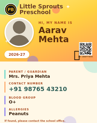
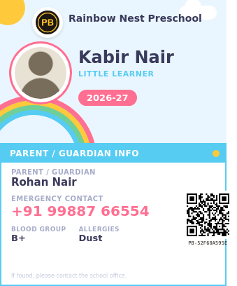
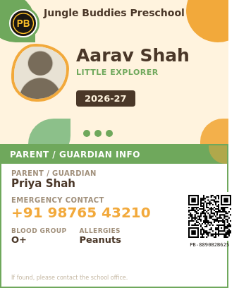
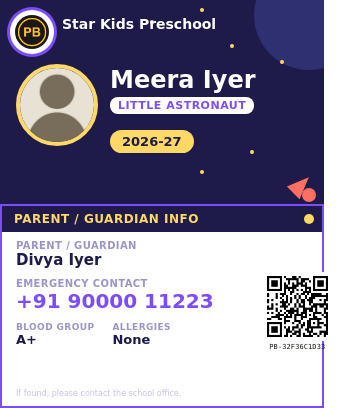
All four use the same fields - school name and logo, the child's name and photo, a parent or guardian's name and emergency contact, and optional blood group and allergy lines - just wrapped in a different theme. Pick whichever fits your preschool's own branding; switching between them later doesn't require re-entering the class list, since it's the same underlying spreadsheet either way. See the full set on the Pre School ID Card page.
Senior student ID card design
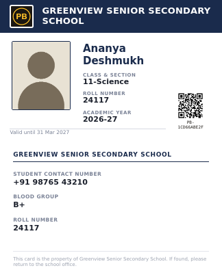
A more institutional look for older students - class and section, roll number, and the student's own contact number rather than a parent's, closer to the ID card students will eventually carry in college or their first job. See more on the Senior Secondary ID Card page.
Staff, teacher & office ID card designs
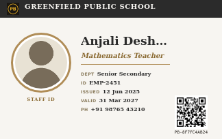
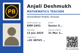
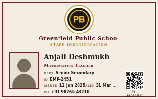
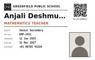
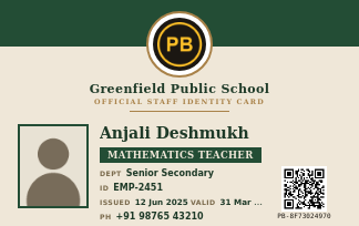
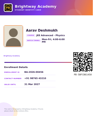
Five staff/office designs, from a strict monochrome badge to a warm institutional seal, plus a coaching-institute enrollment card with course and batch fields instead of a class and roll number. All five staff designs use the exact same field set - see the Staff ID Card page for the full gallery - so switching templates later is a visual choice, not a re-entry job.
Student ID card format vs. employee ID card format
This is the practical answer to "what format should an ID card be": beyond the shared CR80 size, a student card and a staff card carry genuinely different information, because they're answering different questions - "whose child is this, and who do I call" versus "what's this person's role, and are they still employed here."
Student / kid ID card fields
school_name— Your school's name, printed in the header band of the card.school_logo— Your school's logo image — saved once on your account, then carried across every card you generate.student_name— The student's full name, shown large on the front of the card.student_photo— The student's ID photo — a dedicated image column, filled in the same row as the rest of their details.class_section / roll_number— E.g. "11-Science" and "24117" — whatever your school's register calls the class and roll number.student_contact_number— The student's own contact number (senior students), or a parent/guardian contact number (younger students).blood_group / allergy_info— Optional. Left off the printed card entirely when the cell is left blank, rather than printing an empty line.academic_year— E.g. "2026-27", shown as a small badge on the card.valid_until— Optional expiry date. Also omitted from the card when blank.
Staff / teacher / office employee ID card fields
school_name / school_logo— Same as the student card — your organization's name and logo, saved once and reused.staff_name— The employee's full name.staff_photo— The employee's photo — a dedicated image column, same as a student card.designation— E.g. "Mathematics Teacher" or "Administrator" — free text, not a fixed dropdown.department— Optional — e.g. "Senior Secondary" or "Administration". Omitted from the card when blank.employee_id— A unique staff or employee identification number.issue_date— The date the card was issued.contact_number / valid_until— Both optional, both omitted from the printed card individually when left blank.
Notice what's absent from each: a staff card has no parent-contact field, since it isn't relevant to an employee record; a student card has no department or employee-ID field, since a student doesn't have either. Using the wrong field set for the wrong audience is a common design mistake worth avoiding on its own - a "student ID" with a department field reads like a badly repurposed office badge, not a document built for the person carrying it.
Getting the photos right
The photo is the single field most likely to cause a messy-looking batch if it's rushed, since a card's photo box is small and unforgiving of a badly cropped or oddly lit image. A few things worth checking before generating a full batch:
- Use a consistent aspect ratio across the whole batch where possible - a mix of tall portrait shots and wide selfies in the same class set looks noticeably inconsistent once printed side by side, even though each individual photo is fine on its own.
- A plain or lightly blurred background reads better at ID-card size than a busy one - the photo box on most templates is roughly the size of a large postage stamp, and background clutter competes with the face for attention at that scale.
- Good, even lighting matters more than resolution. A well-lit, slightly lower-resolution photo prints more clearly than a high-resolution photo taken in harsh shadow, since printing shrinks the image regardless of its original size.
- For a preschool batch specifically, a recent photo matters more than it might for staff - young children change in appearance quickly enough that a photo from the start of the year can already look noticeably out of date by the spring term.
- Name photo files predictably before a bulk upload (matching a roll number or employee ID) so it's fast to double-check the right photo landed on the right row before generating the full batch.
Why QR verification matters for an ID card specifically
A physical ID card gets lost, copied, or occasionally forged more often than people expect - a lost student card found by a stranger, a staff badge someone tries to reuse after leaving the organization, or a gate security guard who simply can't tell a genuine card from a well-made fake by eye. A unique, scannable QR code sealed onto every real card PaperBee generates gives anyone a fast way to check a specific card is genuine, without a phone call to the office.
It matters most for staff and office cards, where an expired or revoked ID being used to gain access somewhere is a real security concern, not a hypothetical one - a QR code that scans back to a specific, current employee record makes that instantly checkable at a gate or reception desk. For a lost student ID, the same QR code is what lets whoever finds it (or the school itself) confirm it's genuine and trace it back to the right student, rather than it sitting unclaimed in a lost-and-found drawer.
It's a quieter but equally real problem for preschool cards too: a card is one of the few pieces of identification a very young child carries at all, and a parent picking up someone else's child by mistake at a busy pickup line is exactly the kind of low-probability, high-consequence mistake a quick, scannable check is built to prevent.
Designing for preschoolers specifically
A kid ID card template has a genuinely different job than an adult one. It needs to be instantly recognizable to a child too young to read fluently, reassuring to a parent glancing at it during a busy pickup, and durable enough to survive being handled, chewed on the corner, or dropped by a four-year-old on a near-daily basis.
A few things separate a genuinely good kid ID card template from a shrunk-down adult one: a photo large enough to recognize the child at a glance rather than a postage-stamp thumbnail, oversized and simple typography for the child's own name, and the practical information a preschool actually needs on the back - a parent or guardian's name and emergency contact number in large, easy-to-read print, plus blood group and known allergies where relevant. Both of those last two matter more for a preschooler than an older student, since a young child usually can't reliably communicate a medical detail themselves in an emergency.
See the three themed variations - Rainbow, Safari, and Space - alongside the original design, all using the identical field set described above, just wrapped in whichever visual theme fits your preschool's own branding.
Office & employee ID cards
"ID card office" and "ID card format for employee" are searches for exactly this: a workplace that needs consistent, professional-looking staff IDs without hiring a designer or learning Photoshop or Canva for what's ultimately a one-time onboarding task. The staff templates on this page work for that directly - designation, department, employee ID, and issue/validity dates are generic enough to fit any employer, not just a school.
The workflow doesn't change between issuing one new hire's card and re-issuing an entire department's cards after a rebrand - upload a spreadsheet with one row per employee, and every card comes out formatted identically: same logo placement, same field layout, same QR verification, regardless of whether it's five people or five hundred. See the full set of designs on the Staff ID Card page.
Coaching institutes and enrollment ID cards
Coaching institutes have a slightly different version of the same problem: a new batch of students enrolls every term, each needing a card that identifies their course and batch timing rather than a school class and section. The Tuition ID Card template shown above is built around exactly that - institute name and logo, the student's course and batch timing, an enrollment ID, and an optional contact number and validity date.
For an institute running several batches at once, the same bulk-upload flow means a new intake's cards are ready the same day enrollment closes, rather than trickling out over the first week of classes while someone works through a manual design queue.
Common mistakes when preparing the upload sheet
Almost every generation problem traces back to the spreadsheet rather than the tool itself - which is good news, since the fix is usually a two-minute correction to a cell, not a support ticket. These come up most often:
- Renaming a column header. The upload matches columns by exact name, so a typo or rename means that field is silently skipped rather than causing an obvious error.
- Mixing student and staff field names in the same sheet. Each card type has its own field set (covered above) - reusing a student sheet's headers for a staff batch, or vice versa, leaves fields blank that shouldn't be.
- Inconsistent photo aspect ratios across a batch. Nothing breaks, but a mix of tall and wide photos in the same set looks noticeably uneven once printed side by side.
- Merged cells or an extra title row above the headers. Keep row 1 as plain column headers with nothing decorative above it - a sheet built for printing on its own doesn't upload the same way.
- Skipping the small-batch test. Generate two or three rows first and check the PDF before running an entire class or department - catching a formatting issue on three rows is quick; finding it after generating two hundred finished cards means starting again.
A 30-second check before generating a full batch
Free demo vs. free account vs. bulk plans
- The free demo. No signup at all. Good for testing a template's layout and size before committing to anything.
- A free account. Includes a monthly allowance of real, downloadable, QR-verified cards - enough for a small preschool class or a handful of new hires.
- Bulk and higher-volume plans. Built for schools issuing cards to an entire student body at the start of term, or offices onboarding staff continuously through the year.
What the start of a school year actually looks like
Printing, laminating, and lanyards
Since every PaperBee ID card is generated at the exact CR80 standard, the printed PDF fits a standard laminating pouch, PVC card printer, or plastic card holder without any resizing. For a small batch, printing on card stock and laminating with a basic pouch laminator works fine. For a larger batch - an entire school or a growing office - a dedicated PVC card printer (or a local print shop with one) produces a more durable result meant to survive daily handling for a full year or more.
For lanyard or badge-clip use, punch the hole in the same corner across the whole batch rather than eyeballing it card by card - a small detail, but one that makes a school or office's cards read as consistently produced rather than individually assembled. It's a similar principle to picking one or two templates and sticking with them across a school year: a visually consistent batch reads as an organization that runs things carefully, even before anyone reads a single name on the card.